In my infographic, I am seeking to increase awareness of ransomware attacks. Because ransomware is proving to be an easy source of money for hackers, such attacks are becoming ever so more popular. Therefore, in my infographic, I’m trying to inform others what ransomware is, what industries and people are most susceptible, and what could be done to prevent it. Overall, I felt that I was able to succeed in spreading that message, primarily due to the way I structured my infographic.
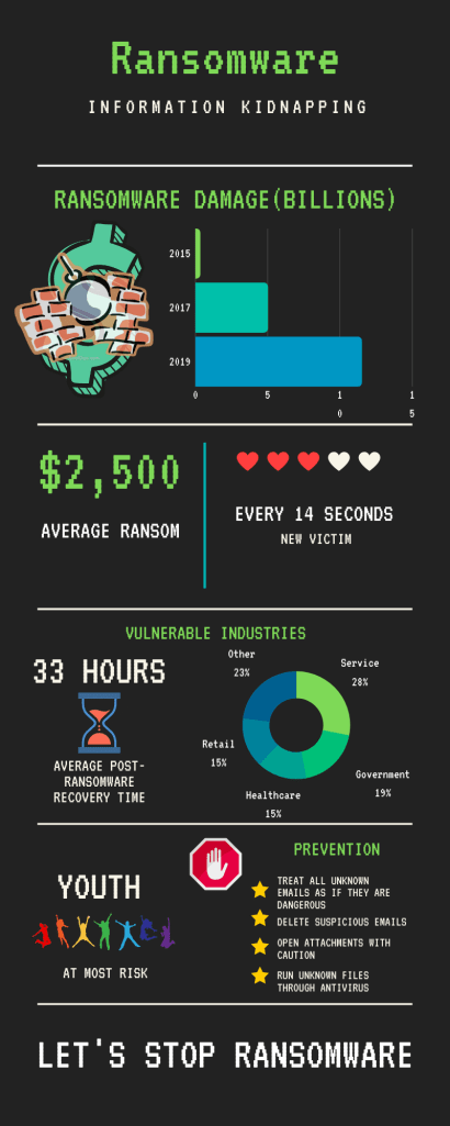
Through data like the post ransomware economic damage bar graph and other statistics, I was able to convey my perspective on ransomware. I specifically chose those talking points with the intention of aiming at the largest audience that I could. By targeting both individuals and companies, I could raise the awareness of both. For instance, through the cost of a ransomware payment, individuals would realize the importance of prevention. Likewise, when companies see the frequency of the attacks, affected sectors, and overall economic damage cost, they would get alarmed and hopefully combat it. To address the concerns of individuals and companies, I decided to address some prevention tips aswell.
The infographic is organized by presenting a problem first and then offering a solution afterward. As the reader navigates down the infographic, they are met with statistics and graphs that would most likely alarm them. Then towards the end of the infographic, some suggestions are introduced to reduce the chance of getting ransomware. Lastly, the last part of the infographic says “Let’s stop ransomware” suggesting that action should be taken by following the prevention tips. Hence the emphasis of the infographic is to take action.
The use of images serves as symbolic bookmarks if one decides to skim through the infographic. Because the images serve as representations of the information in the sections either directly or symbolically, one can get an idea of the content before reading the text. For instance, in the case of the statistics of the frequency of data breaches, the 3 out of the 5 hearts aims to show the video game-like health damage that on takes after going through ransomware. While in other cases, the stop sign with the hand serves to slow the reader down to that section to make sure that they don’t overlook the prevention tips.
If I had the chance to redo or improve on my infographic, I would have done it through an application such as Photoshop. Because Canva is very limiting in terms of data representation as well as general design, it is very difficult to create a nice and artistic infographic. Given the time, I would have designed an infographic that took the appearance of a ransomware software with my statistics blending into the layout. For example, putting the average payment cost into the bitcoin fee section and the average recovery time instead of the remaining time for payment would have been good ideas. While the ransomware software template would have served well to blend in information, it would have also double served as a chance for the audience to see what such software would look like. Thus, the audience would have felt a genuine scare upon looking at the infographic while learning more about what ransomware is at the same time.
The main difference between a blog post and an infographic is the infographics ability to display pure information without the necessity of paragraphs. This allows for direct data delivery without the need to scan through the passage looking for the data. Additionally, the infographic allowed me to visualize the data through graphs which is very difficult to do so with words alone. While it is easy to say the statistics with words alone, getting the scale of the situation through the visuals makes a lasting effect on the audience. By seeing patterns and yearly changes, the audience would be able to understand the severity of the situation better.
